As well as bringing more contemporary and experimental art to Cambridge, one of the best things about ALL has always been the chance to make new friendships and connections, and so on both counts it was great to welcome Timothy Furstnau and his partner Andrea Steves to Cambridge in May for the installation of his work STEERTS YTIC in The Window, our pop-up gallery on Silver Street.
Timothy is a writer, artist, and curator based in Oakland, CA, USA and with Andrea is co-founder and curator of the Museum of Capitalism and the collaborative studio FICTILIS.

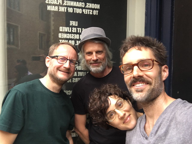
Installation was a relatively wrinkle-free operation, aided and abetted by the very wonderful Jonny Church, our de facto ALL technician. Particular thanks go to the staff of CU Dept of Land Economy, whose offices we invaded during a very busy examination period.

Then it was time to see the sights, as we took to the waters of the river Cam. Tim proved himself to be a natural with the punt pole and Jonny provided us with an impressive range of Cambridge trivia (at least some of which was based on fact) as we meandered down the Backs.


Finally, after an impromptu talk by Tim about his work it was time to retire for refreshments at The Anchor before ensuring that Tim and Andrea caught their train to Gatwick and home.
Many thanks to everyone who helped make this possible, especially Jonny Church, Judith Gaskell, Rosanna Greaves and the staff of CU Dept of Land Economy.
About STEERTS YTIC
“STEERTS YTIC” is a conceptual text piece that consists of adhesive vinyl applied to the inside surface of street-facing glass in the styles of typical storefront window signage. However, rather than the usual content advertising what’s inside the building, the text in this installation is intended to advertise the features and benefits of what’s outside, in the streets: the people, the architecture, the surface textures, sounds, and myriad other unique qualities that make city life interesting.
The text borrows from the language of retail and advertising to draw attention to a resource available to all in the free, public experience of city streets. It is written to ‘read’ from the inside, which appears backwards from outside, and it is precisely this apparent mistake of the installation that encourages people to notice it. After reading a few lines, viewers slowly realize that the text is referring to their side of the glass, to the space they inhabit, and even, specifically – to they themselves, and the very act of reading window signage. (The piece’s title is the words “City Streets” spelled backwards.) It is the viewer who is being put on display, with the beautiful backdrop of Cambridge’s exterior, from the implied perspective of the interior space.
What “STEERTS YTIC” asks of its viewers (that they take a moment to read a bit of backward text in a window display) is a precursor to its implied exhortation – that we all take a moment to notice our surroundings, be receptive to unexpected encounters, and examine closer the everyday wonders of city streets.
Cambridge Version
“STEERTS YTIC” first appeared in Seattle in 2010, commissioned by the Seattle Storefronts program for a vacant storefront in the heart of the International District or “Chinatown” neighborhood. The text was installed in English and Mandarin, and remained on display for several months.
For the Cambridge version, new custom text was written to reflect the Silver Street location and the wider Cambridge/UK context. In a few short words, the text includes references to local architecture and historical handicraft, tourism, the UK’s austerity programme, the University’s famed life sciences department, and that celebrated local observer of urban life, Shakespeare. But the formatting (in Impact font, installed to be read backwards from outside) and the tone of the text remains the same, hovering somewhere between the garishness of window advertising and the subtlety of poetry.
